Examples of Website Content
October 18, 2022 •Chris Gabryszewski

First impressions matter. In the world of business, your first impression with customers is almost always through your website. In fact, 81% of consumers conduct research online before making a purchase. With at least 10 examples of website content, it can be difficult to narrow it down to one.
Not only does your website need to engage new and returning visitors, it also needs to show up on search engine results pages (SERPs). This is especially important considering that 75% of searchers never go past the first page of Google. So what pages should a website have to show up on page one of Google and convert readers into paying customers? We’ve got you covered!
What Is Website Content?
Website content is information that is hosted on your website, presented through a variety of media. This can include bite-sized information like contact details, your company’s value propositions, and mission statement. It can also incorporate long-form content like blog posts that educate visitors and establish you as an authority in your industry.
While your web content is a powerful communication tool, successful websites often include multimedia content to capture visitors’ attention and drive them to take your call-to-action (CTA). Pictures, videos, graphics, and audio clips can get visitors interested and help them find the information they are looking for quickly.
What Should a Website Contain?
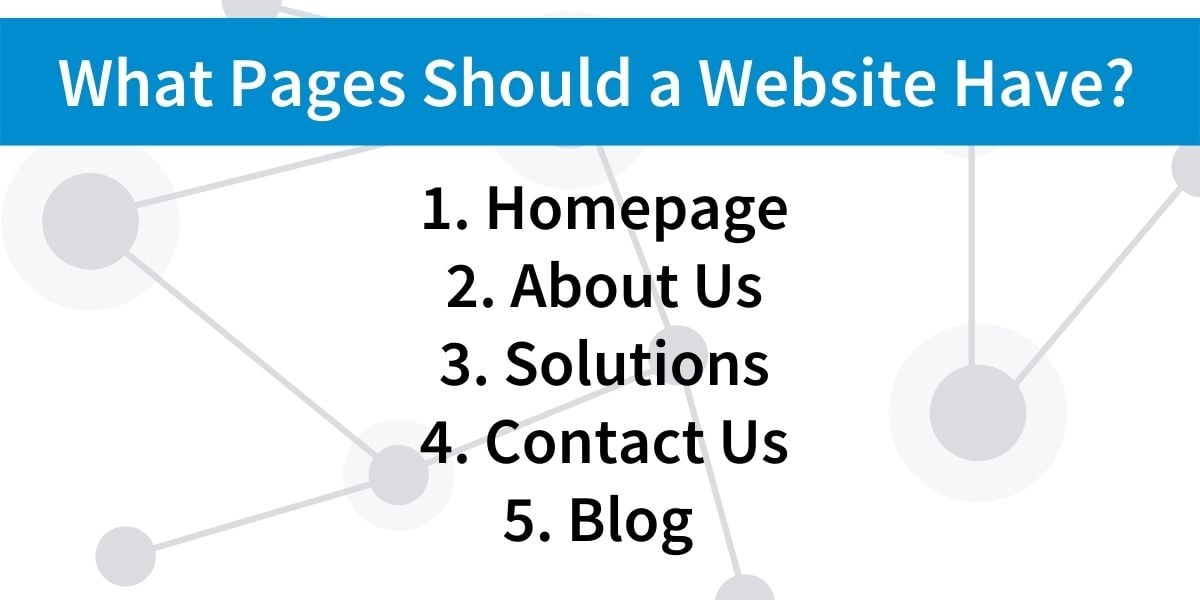
The 5 most important things for a website to include regarding content are: the homepage, the about page, the solutions page, the contact page, and the blog page. Each of these pages has a specific purpose and will guide visitors along different steps in their customer journey. Let’s break down their roles, then we’ll get into examples for each:

1. The Homepage
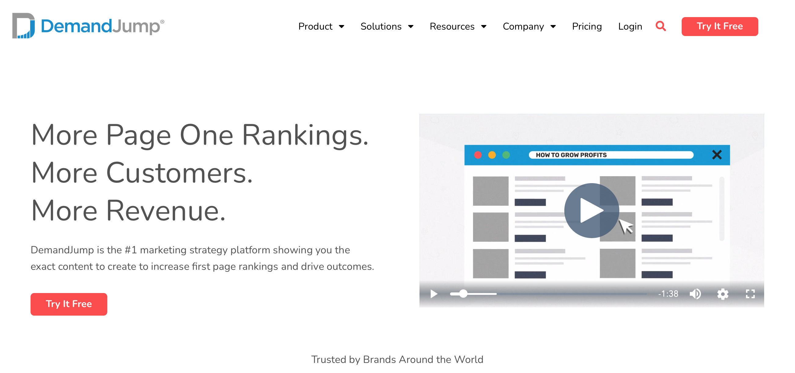
As the first page most visitors will see on your website, your homepage is the best chance for your business to make an impactful first impression. Homepages include the who, what, and why of your business. But they also need to be concise to capture your reader’s attention. There are a lot of directions you could take your homepage, with some getting better results than others. At DemandJump, we find that it’s best to start with the why—why should you choose to do business with us? Because we help you get “More page one rankings. More customers. More revenue.” Once visitors see that we have something of value to offer, they can scroll down to learn more about how our service works and what the experience has been for previous customers.

2. The About Page
Customers don’t just care about what you do (although that’s still very important); they also care about who you are and what your business values are. Stories like these are a powerful sales tool. They build connections on an emotional level to enhance the practical solutions you offer. For example, some customers prefer to work with environmentally-conscious businesses, while others like supporting businesses that were founded by women. Be proud of what you stand for, and customers that share your values will follow.
3. The Solutions Page
At the end of the day, people are visiting your website because they are looking for a solution to one or more of their problems. Make sure that you are communicating that you’re the solution. Your messaging here should be clear, concise, and appropriate for your audience’s knowledge level. If you’re selling paint to families who are redoing their bedrooms, you don’t have to get into the nitty-gritty of exactly how your paint is made. They just need to know how long it will last, the number of coats needed, and if there are any hazardous chemicals involved. On the other hand, if you’re selling paint to another paint shop, you’ll want to go more in-depth.
4. The Contact Page
The contact page enables every salesperson’s dream—a lead that requests more information or to set up an appointment. Your phone number, email, and mailing address should be here. Some businesses opt for an online form over email for easier management and to reduce spam.
5. The Blog Page
Most of your web content should be short and to the point. Your blog page is your opportunity to post long-form content that can educate your audience on how to solve their problems, therefore building your authority as an expert in your industry. Blogs tend to range from 750 to 3,000 words in length, and shorter blogs should link to larger pieces within the same topic. Sample topics for content writing include: how-to blogs, ultimate guides, and frequently asked questions (FAQs).
What Are Some Examples of Content?
To help you visualize how a website can come together, let’s go through some website content examples using a fictional bike shop: Cyclin’ Fred.
- The messaging on Fred’s homepage is straight forward: “Bikes for however you cycle. Road bikes. Racing bikes. Mountain bikes.” Whichever type of cyclist you are, you can find a bike at Cyclin’ Fred. As you scroll down the homepage, you’ll also get a glimpse at his mission, “Helping people find their passion for cycling” and several customer testimonials that boast Fred’s excellent customer service.
- Cyclin’ Fred’s about us page repeats his mission and tells the story of why he decided to start a bike shop. He shares why he cares about different types of bikes instead of just one. To help tell his story, Fred includes pictures of him cycling with his family, who all prefer different styles of bikes. The tone is inspirational with the intention that readers can visualize themselves improving their lives with a bike that takes them where they want to go—down city streets, speeding through races, or barreling down mountainsides.
- Cyclin’ Fred’s solutions page, simply titled “Bikes,” breaks down bikes by activity, experience level, durability, and price. This allows readers to quickly find which bike is right for them based on the qualities they care about most. Videos of cyclists in action make it easier and exciting for customers to picture themselves riding one of Fred’s bikes.
- Fred placed a “contact us” button at the bottom of each of his webpages, which link to his contact page where readers can find the shop’s phone number, email address, and social media profiles.
- Finally, Fred writes a bi-weekly blog that covers topics from bike maintenance to exciting places to ride. This attracts people to his website who are early in their buying process. They might be researching whether they’d like to start cycling in their area or how to repair their current bike. After getting information from Fred’s website, they’ll be more likely to buy from him when they’re ready for a new bike. Fred also includes a call-to-action (CTA) at the end of each of his blogs that encourage readers to call him with any cycling questions or to visit his shop and test out his bikes.
To see some examples of successful web content in the real world, revisit some of your favorite websites. What do you like about them? Are they visually appealing? Is their copy broken up into easy-to-read sections? Do videos keep you interested?
You can also click through our DemandJump website to see how we put our own advice to work!
How Do I Find the Best Website Content Ideas? DemandJump.
Writing web content is a lot of work, and DemandJump helps ensure that your hard work pays off. With our insight generators, you can learn exactly what terms and questions people in your target audience are searching for. This helps you write content geared toward their interests, and it helps you rank higher on search engines, so people will actually see your website. To give you a head start, our content briefs tell you which keywords to include for each piece you write. Ready to take the guesswork out of content creation? Let’s get started!
Featured Articles
Categories
- Attribution Tracking (13)
- Channel Optimization (11)
- Consumer Insights (68)
- Content Marketing (251)
- Data Science (8)
- Digital Marketing (6)
- Digital Transformation (26)
- Enterprise (10)
- Lead Generation (14)
- Market Intelligence (8)
- Marketing Analytics (39)
- Marketing Attribution (57)
- Marketing Management (153)
- Marketing Operations (86)
- Organic Search (222)
- Paid Search (52)
- Pillar-Based Marketing (63)
- Programmatic Advertising (9)
- SaaS Content (14)
- SaaS Marketing (29)
- Search Marketing (111)
- SEO Keyword Research (28)
- SEO Pillar (18)
- SEO Strategy (46)
- SMB (5)
- Website Content (12)


